Exhibition TRACES OF A TIME – Film poster 1945–1970, which will feature film posters from the holdings and archives of the Film Center of Serbia, will be open to the public from 1st April at 12 o’clock in the Film Gallery of the Cinema Hall of the Cultural Centre of Belgrade, and will last until 15th May. For the exhibition 50 posters of films made in the 1940s, 1950s and 1960s were selected and they represent significant works of Yugoslav cinematography, such as I Even Met Happy Gypsies, When I am Dead and Gone, Early Works, March on River Drina, Captain Lechi and many others.
There will be no official opening due to anti-epidemic measures, but the director of the Film Center, Gordan Matić and Prof Jovan Čekić, PhD, author of the text in the exhibition catalog will be at media disposal.
FILM POSTER AND THE LITERACY OF ATTENTION
By Jovan Čekić
The first film poster, authored by Marcellin Auzolle, was printed in order to promote the film Tables Turned on the Gardener (L’Arroseur Arrosé, 1895) by brothers Lumière, without doubt owes a lot to the lithographs of Henri de Toulouse-Lautrec and to the substance that was characteristic of Lautrec’s style: a minimalism of sorts, with superb use of typography, simultaneously creating a sense of atmosphere and forcing the attention of the viewer towards its highlights. In the poster for the brothers Lumière film, which runs for the whole of 45 seconds, the forefront is dominated by the laughing audience, while in the background we can see one of the slapstick scenes involving the gardener.
The foremost purpose of a film poster is to announce the film that will soon be arriving in theaters and to inform the audience about the date of the premiere, the title and the main character(s) of the movie. The visual of the film poster strives to suggest a specific genre as well as the narrative of the film, so that the viewers can ascertain whether this is a film that might interest them. Besides that, with the appearance of the first film posters, the designers had to contend with what has since the 1970s up until the development of contemporary digital platforms, been called the “attention economy”. Sublimating some of the most important aspects of a film in a collage/montage of sorts, posters above all endeavored to draw the attention of potential viewers. They were a sort of “artistic” interpretation of the film, where the designer aimed to depict the theme of the film as effectively as possible. With the first film posters, the “grammar” of the new literacy of attention emerged for the modern viewer. For film studios from Hollywood to Mumbai, attention quickly became capital, and film posters became the symptom of its expanding power over the masses. With the development of technical reproduction capabilities, especially with film and later, television, even before the internet, it became clear that attention is a limited resource and that different media are poised to fight over it. The relation between visual and textual elements was dependent upon the desired effect, but in any case, in the 1980s, film posters were dominated by illustrations. Posters were made in different sizes, and the content of the illustration sometimes differed in domestic and foreign versions.
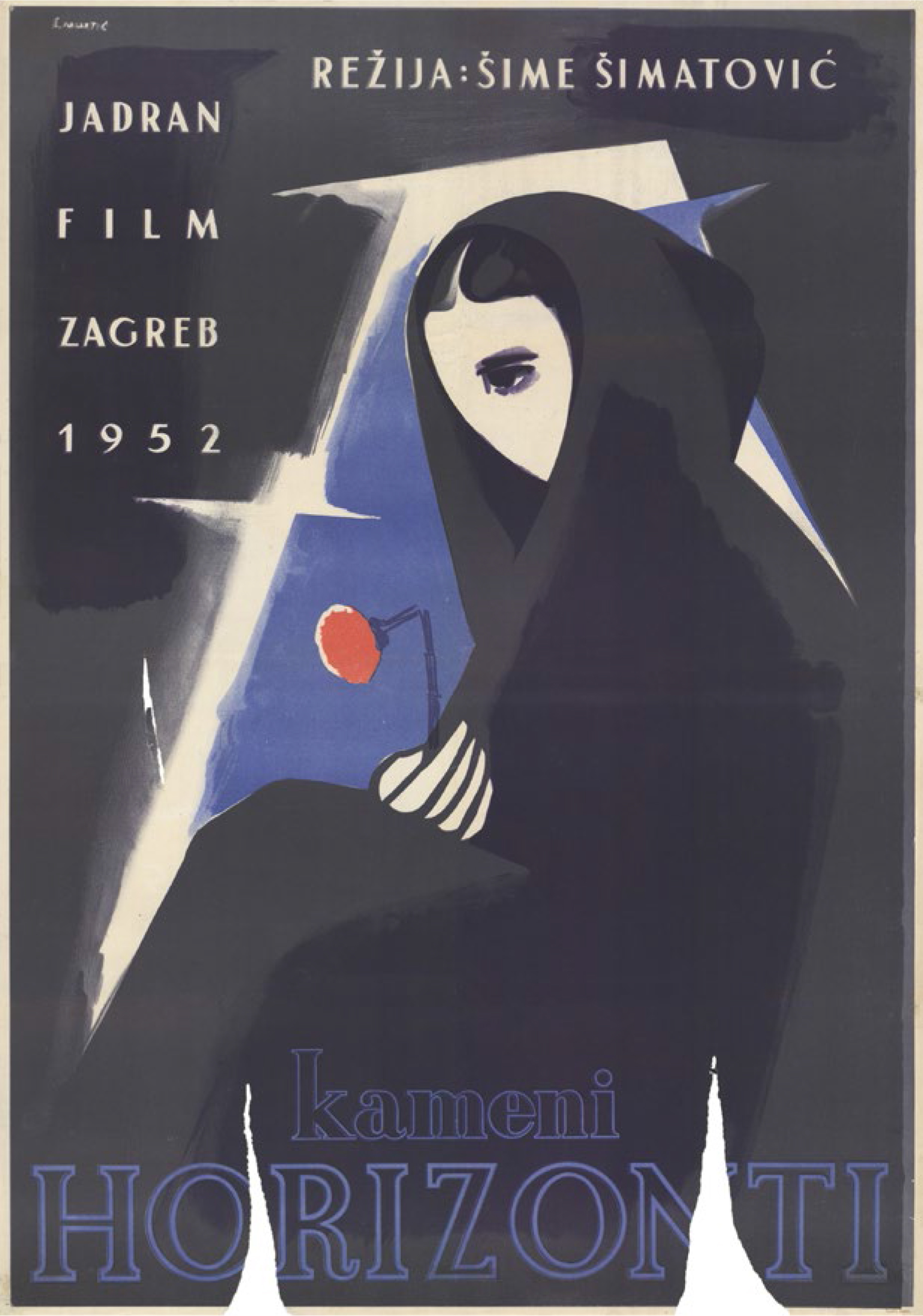
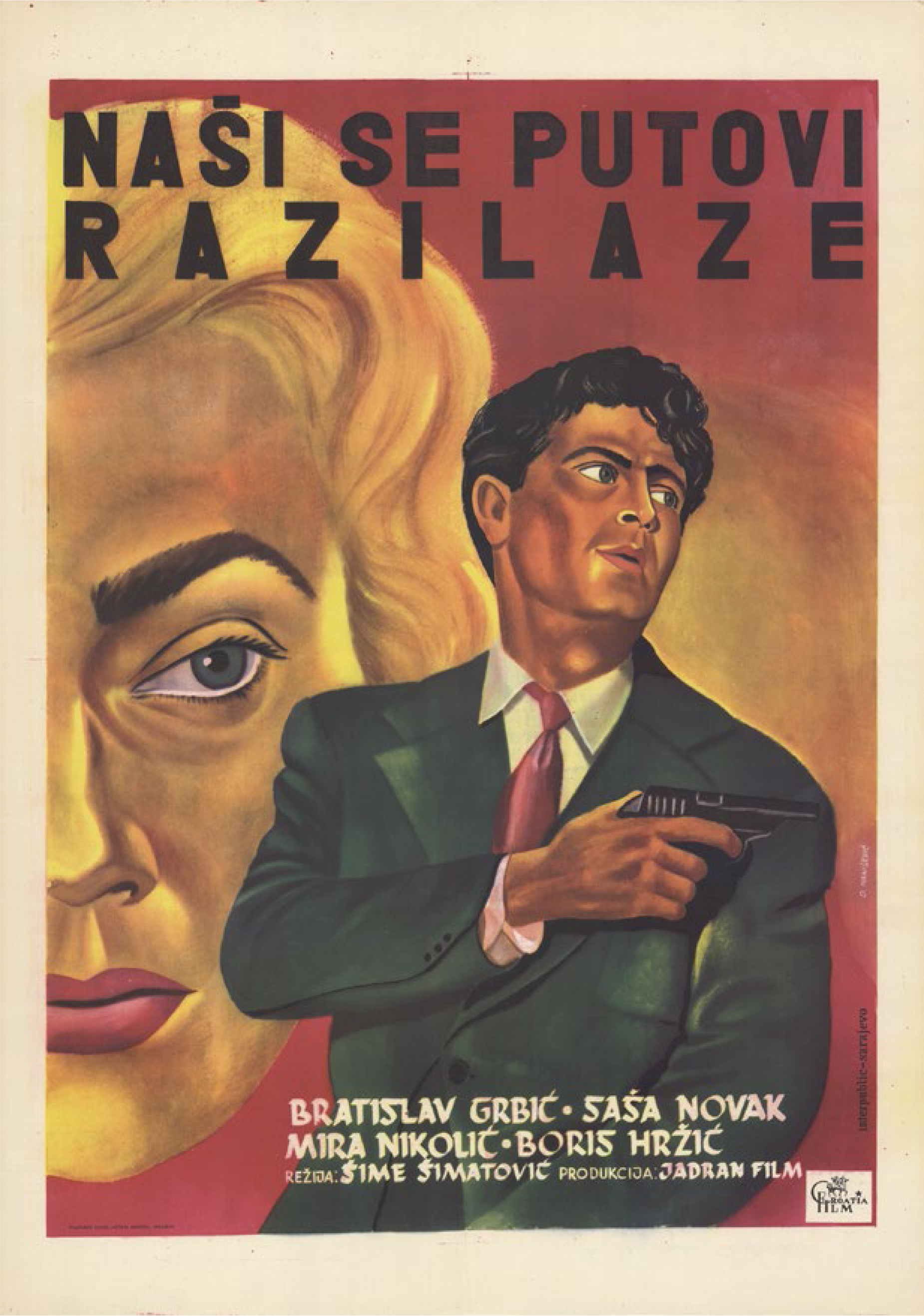
Yugoslav film posters from the 1950s, despite the dominant political ideology, largely follow the development of basic patterns of “attention economy” coming from the West, sometimes succeeding brilliantly. On the poster for the film Slavica directed by Vjekoslav Afrić, next to a still from the film one can read that it is the first domestic live-action film as well as all other relevant information, starring roles, camera operators, music, producers and distributors. Another poster for the same film, next to a stripped-down line drawing which, in true Hollywood style, sublimates specific scenes from the film, delivers a lot of additional information about production, as well as the filming location: “Filmed in and around Split”. Posters dominated by exquisite drawings or minimalist art, unburdened by commercial pressure of the market, often achieve remarkable effects specifically because the spotlight is on the graphics. That is the case with the posters for films Don’t Wait for May directed by František Čap, Unfaithful by V. Pogačić, Mr. Ikl’s Jubilee by Vatroslav Mimica, Little Man by Ž. Čuklić, Black Pearls by T. Janjić and Hanka by S. Vorkapić. Many posters were created in two versions, with one featuring minimalist graphics, and another dominated by a photo of the actors or a selected still from the film, as was the case with Stone Horizons by Šimatović, The Magic Sword by Nanović, as well as A Suspect Person by Soja Jovanović. While two versions of the poster for In the Storm (1952) directed by Vatroslav Mimica demonstrate the scope of possible approaches, from abstract minimalism to purely emotional narrative.
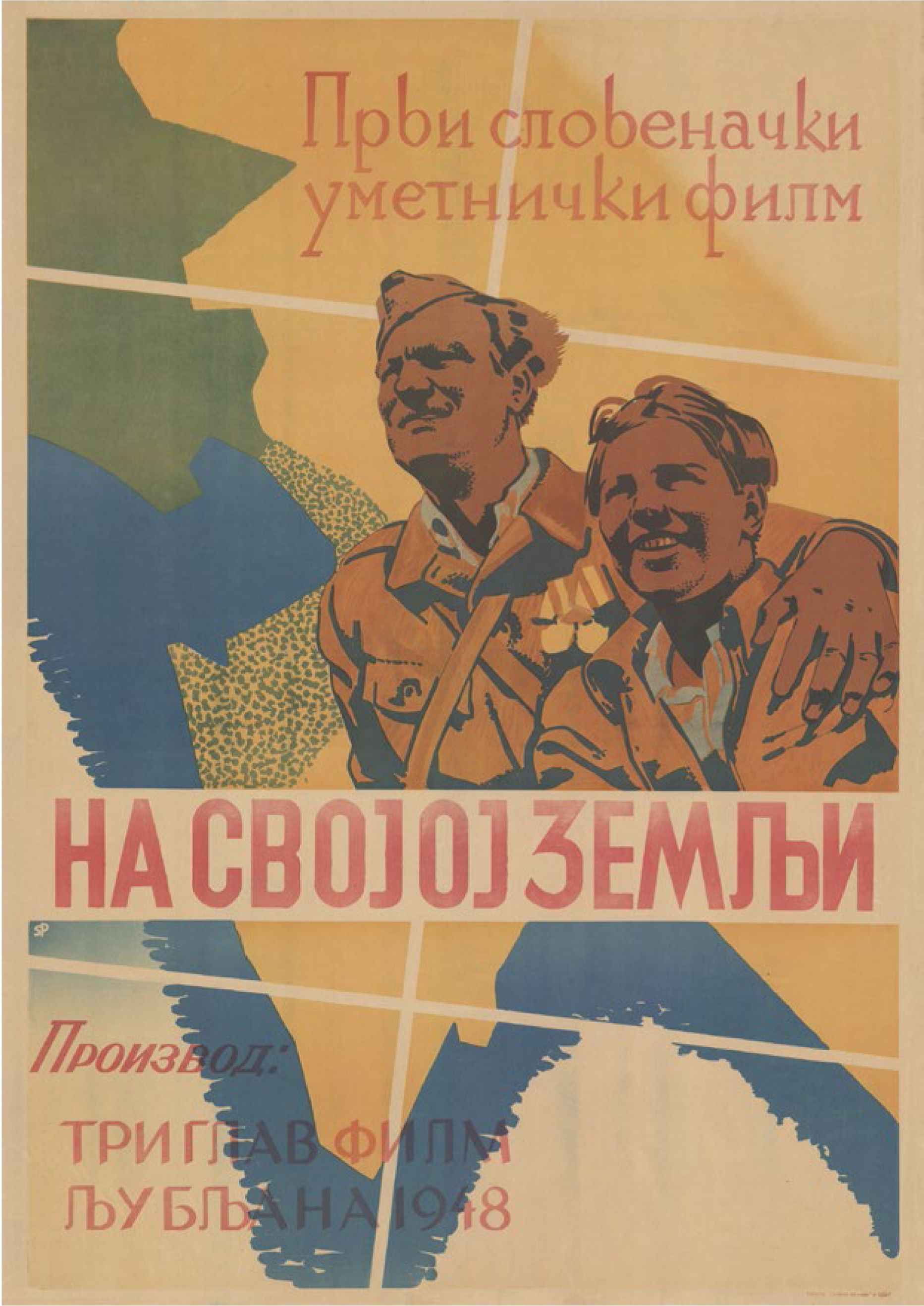
Some of these attract attention through their very radical absence of information, where only the film title and sometimes producer or director credit can be seen, as is the case with Three Stories (Jane Kavčič, 1955), On Own Ground (Franc Štiglic, 1948), Barba Žvane (Vjekoslav Afrić, 1949) … It is also frequently accentuated that the film in question is domestic and artistic, which was obviously meant to differentiate it from foreign, or otherwise documentary or propaganda films of the time. On the other end, we have posters based exclusively on film stills and basic information. A great example can be found in the poster for I Even Met Happy Gypsies (1967) by Aleksandar Petrović, which focuses the viewer’s attention on the figure of an old Roma woman, smoking her pipe, suggesting that this face hides a phantasmagorical story about an unusual culture of urban nomads. A similar thing could be said of the poster for his film Maestro and Margarita where the collage of photographs of naked bodies achieves the effect of a mass of people descending hurriedly down the stairs. Finally, there are posters which more or less successfully follow Hollywood patterns, where the aim is to capture some of the film’s atmosphere or to suggest its genre. That is the case with comedies by Soja Jovanović, such as Priests Ćira and Spira and A Suspect Person, or the musical comedy All to the Seaside (1952) by Sava Popović. The Hollywood pattern is followed by posters for films of different genres, such as The Song from Kumbara (1955) by Radoš Novaković, Concert (1954) by Branko Belan, Look for Vanda Kos (1957) by Žika Mitrović and certainly the poster for Three Steps Beyond (1958) by Vojislav Nanović.
For all those who grew up with movies, posters were a kind of signpost showing the way through their youth, now deeply engraved in their memory. It is not surprising that collectors of old movie posters are ready to set aside serious sums of money for some of the most attractive ones. Film posters are a part of youth, irreplaceable topos on the winding line that is the process of growing up, which shaped entire generations in the increasing media chaos. With the advent of new distribution channels, first VHS and DVD, then the internet and various platforms like Netflix, it seems that the movie poster has not lost its importance – on the contrary, it has only become more adaptable in the digital environment. Even when digitally enhanced photography dominates it, the film poster retains its own logic of “attention economy” in its aim to remain recognizable. In the face of an overwhelming inflation of images, when numerous algorithms offer users new content that is closest to their interests, there is no longer any doubt that attention is a limited resource, so there is more and more talk about “attention ecology”. That is why film posters from the time when film had the power to change the sensibilities of entire generations have an increasing emotional and cultural value, outlining the patterns along which literacy of attention has emerged as a constitutive element of the “new sensibility”.
